There's been a lot of talk in the past year about the 1% vs the 99% wealthiest Americans. And while I sympathize with many of Occupy Wall Street's aims (even though when my wife and I walked downtown to see them a few months ago they looked like a bunch of crazy people), it's useful to keep in mind that the wealth divide is very different if we widen our view to the whole world.
That's just what the site GlobalRichList.com has done. It's very simple - you type in your income and it tells you where you fall in the distribution of the whole world's population.
Surprisingly, the income cutoff to be in the world's richest 1% is only $47,500. Doesn't sound too rich, does it? In fact, median household income in the US is about $50,000. Median income per person in the US is about $32,000 - which is still in the top 6% worldwide.
So, the average American is in the 6% wealthiest people worldwide.
Does this mean we shouldn't lobby for a little more income equality in America? No, there are still good reasons to do that. But it does mean we should widen our goals to include the whole world. And perhaps we should remember not to take what we have for granted, and maybe even be willing to part with a little of it to donate to whatever causes we find worthy.
Update: More links:
Household income
Personal income
Americans make up half of the world's richest 1%
Nice blog post by Scott Sumner - The Money Illusion
Similar Washington Post article

Monday, February 20, 2012
Sunday, February 12, 2012
Breaking News! Warning! Everything is OK!

I found this today, forgot I had taken this screenshot a few months ago. It's the home page of the New York Times. Notice the "Breaking News" banner? It's a rare banner they use when something really critical is happening. This one says, "Stocks Remain Volatile on Wall Street, Opening Up More Than 1%."
In my book, when I talk about sensationalism and a loss of perspective in the media, this is a small example of it, right here. And the NY Times is certainly not the worst perpetrator, in fact, they're usually pretty reasonable. But even they can succumb. Is it any wonder that reading the news (and more commonly, watching it) causes stress and anxiety to a lot of people? The whole tone and language and placement of that banner implies something bad is happening. It says, "Stocks remain volatile," which sounds terrible. But in reality, stocks rose, which is generally good news. It's an odd way to position it. And those subtle ways of picking and choosing what gets highlighted, and how it is conveyed, add up over the hundreds of thousands of days we see the news.
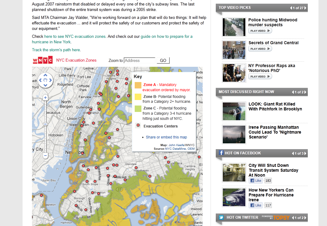
Here's another example, this time from the Huffington Post, which really specializes in sensationalist headlines. It was from around the same time, back when Hurricane Irene battered the East Coast. The headline on a story on the right of the page says, "Irene Passing Manhattan Could Lead to 'Nightmare Scenario.'" Now, Irene was a serious and definitely newsworthy event, and it's good to be prepared, but "nightmare scenario"? It makes it sound like the skies will be raining blood.
These also remind me of the Long Island Railroad, which I had to get used to recently after years of using New Jersey Transit. In NJ, you only hear announcements if there is a delay or something wrong. But not on Long Island. The announcements at the local stations come on a few minutes before the train is due to arrive, and announce in an agonizingly slow and roboticized voice, "ATTENTION ... Long Island passengers ... the 4:29 ... PM ... train ... to Penn Station ... is operating ... ON TIME." Great, thanks for the update. It's almost like it's designed to instill a constant low-level anxiety - for no good reason.
Friday, January 13, 2012
Why the heck is crime so low?
Crime goes up in a recession, right? More people are unemployed, and some of them get desperate. It's only common sense.
Well, think again. Crime rates in the U.S. have been dropping for 20 years, and in the two years since the recession hit, they've dropped even faster. Take a look at this chart, courtesy of this BBC News article:

So why is this happening? The frustrating thing is, no one knows for sure. But there are lots of theories, and I think a combination of the following ones makes the most sense:
- Smarter policing
- More people imprisoned
- Reduction of lead poisoning
- Baby boomers aging (fewer young people)
- Video games
The video games theory is particularly interesting … recent studies have shown that playing violent video games does increase violent tendencies slightly, but this is more than offset by the simple incapacitation of sitting at home playing video games rather than going out to commit crimes. In other words, if video games are increasing aggressiveness at all, players are then taking out that aggressiveness on more video games.
At any rate, no matter what the true cause of the reduction, it's good news. Now if we can just keep that crime rate low without imprisoning quite so large a percentage of our population - strike a slightly smarter balance there, and make sure our prisoners are treated as humanely as possible - it would be the best of both worlds. (For more information about that issue, I recommend When Brute Force Fails by Mark Kleiman.)
And for more details about the crime drop - specifically, homicide, which has just dropped off the list of the top 15 causes of death for the first time since 1965, check out this Washington Post article and this other one, too.
Monday, December 26, 2011
The mysteries of photography reveal progress
I just read Errol Morris's excellent book, Believing is Seeing (Observations on the Mysteries of Photography). Every bit of the book is thought-provoking, as he takes old photographs and analyzes them to find out the stories behind them, which brings up all sorts of questions about what truth is and how accurately we can portray and remember it. One small portion of the book reminded me of the Secret Peace so I thought I'd share it.
Have you ever seen either of these famous photographs?


The first one is by Arthur Rothstein, from 1936. The second is also from the same year, by Dorothea Lange. Both of these photos perfectly evoke the desperation of the Great Depression and the Dust Bowl, and have become iconic pieces of American history.
But when we come back years later, this is what we find:


We see the little boy on the right of the Dust Bowl photo, now grown and in his own home, as well as a story in Look Magazine about "The Dust Bowl Turns to Gold." Then we also see the "Migrant Mother" herself, surrounded by her three now-grown daughters, posing in one of their suburban backyards. Put simply, here is photographic evidence of people who are much better off than they were in the 1930s.
In The Secret Peace book, I don't mention many cases like this, because they are only anecdotal evidence. In and of themselves, they don't build a case for progress because they are only two examples. And you can always find counter-examples. (Although it would probably be difficult to find many families worse off than they were during the '30s, and even harder the farther back in time you go ... this would be an interesting experiment.) So the book focuses on broader statistics. Nevertheless, these pictures are riveting in a way that statistics can not be; in fact, this was the point of the original photographs themselves.
Morris's book goes into a lot more nuanced detail about these photographs as well as many others, of the Crimean War and Abu Ghraib, for example. It's a fascinating read that I highly recommend. You'll never look at photographs the same way again.
Friday, December 23, 2011
2011 was a bad year to be a dictator
The Daily Beast has a well-done short photo slideshow of 2011's most notorious fallen dictators. Remind yourself how far the world has come this year alone by reading about the nutcases who will no longer be tormenting their citizens, from Gaddafi to Mubarak and more - not to mention Kim Jong-Il. North Korea's future remains up in the air, but in most of the rest of the cases, the dictators' downfalls spell increased freedoms for their peoples. Honestly, compared to most of human history, there are hardly even any dictators left in the world. Here's hoping we get rid of the rest of them soon.
Check out the slideshow here.
(Osama bin Laden isn't included in the list, since he didn't rule any country (thankfully), but let's not forget to loop him into the broader category of won't-be-missed when reminiscing.)
Check out the slideshow here.
(Osama bin Laden isn't included in the list, since he didn't rule any country (thankfully), but let's not forget to loop him into the broader category of won't-be-missed when reminiscing.)
Wednesday, December 7, 2011
We live in a much safer world
In honor of my wife and I leaving today for St. Martin, for our first vacation in years, here are some reassuring statistics about flying, as well as other safety measures.
To start with, want to guess how many fatalities there were on U.S. airlines in 2010? Your guess is either going to be correct or too high, because there wasn't a single one. This is the third year in the past four without a single death, despite more than 10 million flights with more than 700 million passengers a year. (The Week, Feb 4, 2011)
In fact, as Stephen Moore and Julian Simon mention in It's Getting Better All the Time, "Peter Spencer of Consumers' Research magazine estimates that if an individual were to take a random flight every day, on average 20,000 years would pass before the person perished in a fatal crash." These charts are from their book, too.

Here's a look at death rates in the U.S. from natural disasters. Of course, this chart ends at 2000 and so doesn't include Hurricane Katrina (for example), but the overall trend is clear.

The rate of accidents for infants has fallen 88 percent since 1900, and the rate of accidents for seniors has fallen 72 percent. "Americans are now employed in occupations that are far safer than in the past. The accidental death rate at work has plummeted from about 38 per 100,000 workers in 1930 to about 28 in 1950 to about 4 per 100,000 today."

Saturday, November 19, 2011
Vaccines save lives
Sure, you knew that the world eradicated smallpox in 1979, but did you know polio has also been eliminated 99% worldwide?

Bill Gates narrates a short talk about vaccines and why they're so important - and also so easy, so cheap, and so obvious as a means to save lives. The talk was animated in a fun way, check it out (it's only 3 minutes long):
The Bill & Melinda Gates Foundation also has a neat interactive infographic on its site, illustrating the fight against malaria, as well. You can see all the progress the world has made, and how much more we still need to do to ensure a healthy life for everyone.
Subscribe to:
Posts (Atom)